...Cards?
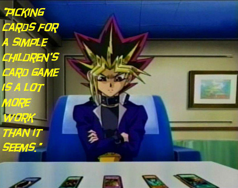
So many cards...
Aside from being in children's card games, cards are useful in a variety of ways. But what are cards in Bootstrap? I'd say Bootstrap itself gives the best explanation in that regard.
A card is a flexible and extensible content container. It includes options for headers and footers, a wide variety of content, contextual background colors, and powerful display options.
That sounds like an awful lot. Which it is, cards can be expanded on and bent to your will in a variety of ways. So much so that many elements of the website which used to have its own CSS was replaced into card format, usually gutting out many lines of CSS code from our main.css each time. So let's go through some of the major moves to cards and how it often improved the appearance of the site.
List Cards
Let's go for the most obvious cards, as you see these all over the site. In fact, you see them right now on this page, to the left on desktop view on the bottom of the page in mobile view. These cards grab from a list and...hang on, that sounds awfully like how it gets a list for the navbar. That's because it does. The Perl code is boring and you have seen it in complex form, so let's go for the HTML part.
<div class="row no-gutters">
  <div class="col-12 mb-3">
    <div class="card BlogFinnCard">
      <div class="card-header p-2 text-center">
        <span class="small">Finn's blog</span>
      </div>
      <div class="list-group list-group-flush sccard entries text-center">
        <a class="list-group-item list-group-item-action entry title link small p-2"></a>
      </div>
    </div>
  </div>
  <div class="col-12 mb-3">
    <div class="card SCNavbarBlog">
      <div class="card-header p-2 text-center">
        <span class="small">Latest Blogs</span>
      </div>
      <div class="list-group list-group-flush text-center">
        <a class="list-group-item list-group-item-action scnavbarblog entry title link small p-2"></a>
      </div>
    </div>
  </div>
  <div class="col-12 mb-3">
    <div class="card NewsCard">
      <div class="card-header p-2 text-center">
        <span class="small">Latest News</span>
      </div>
      <div class="list-group list-group-flush sccard entries text-center">
        <a class="list-group-item list-group-item-action entry title link small p-2"></a>
      </div>
    </div>
  </div>
</div>
The fun thing to note is that the code which does the latest blog list is actually the same code used in the navbar. The only reason the news one isn't reused is because we made a resuable Filter just for cards. With that we could make fairly simple small pieces code for the latest part of someones blog or such as we wanted. The rest of this logic is fairly similar to the navbar code, essentially doing a repeat of the listgroup entry to make a nice looking list of all the posts for each one. This way, we could scrap the use of the "sidebar" filter which had been butchered and reused in a number ways. This was split out with our various smaller filters (also made the Perl code easier to read) and could selectively choose what elements we added to a blog. So in this scenario, I can choose to list more of my own blog posts in my blog, whereas Mark Keating may want one listing more of his blog posts on his section.
Lists with Cards
Not the same as list cards, trust me.
<div class="SubList row no-gutters" style="-scs-min-depth: 1; -scs-max-depth: 4">
  <div class="entry col-12 card mb-3">
    <div class="card-header">
      <a class="entry link d-flex justify-content-between">
        <h4 class="entry title my-auto"></h4>
        <p class="entry published_at text-right small my-auto"></p>
      </a>
    </div>
    <div class="card-body">
      <h5 class="card-title entry subtitle"></h6>
      <p class="card-text entry description"></p>
    </div>
  </div>
</div>
The code which lists the pages available was also changed, in this case the one that lists all blog posts i have done on my blog as seen here. Well, technically the underlying Perl code here hasn't changed at all, but instead made to look far more sane and lined up, plus actually readable on mobile. This way it happily married the listing with Bootstrap. Plus, I personally love the way it all happily is in line and has subheadings and description text, while distinguishing which post the description pertains to aesthetically.
Actual Decks!
That header bothered me far too much.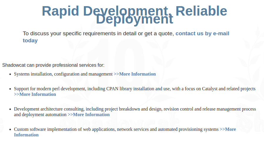
I make all these Yu-Gi-Oh! jokes in this post, but we do actually use Bootstrap card decks on this website. Or rather, we use them in the Services page. The old page had a broken header and the list looked fairly...eh. This can be seen by this paragraph with the image. Click it if you're struggling to see it for full size. Either way, there was no way we were retaining the view as it was and were going to overhaul it. Plus it meant I could get rid of a bunch of custom CSS that as you can see was not helping it aesthetically one bit.
So with that in mind, let's make a deck.
<div class="card-deck">
  <div class="card mb-3">
    <div class="card-body">
      <p class="card-text">Systems installation, configuration and management.</p>
    </div>
    <div class="card-footer text-muted text-right">
      <a href="/servers" class="btn btn-primary">More Information</a>
    </div>
  </div>
  <div class="card mb-3">
    <div class="card-body">
      <p class="card-text">Support for modern perl development, including CPAN
  library installation and use, with a focus on Catalyst and related projects.</p>
    </div>
    <div class="card-footer text-muted text-right">
      <a href="/services/support" class="btn btn-primary">More Information</a>
    </div>
  </div>
  <div class="card mb-3">
    <div class="card-body">
      <p class="card-text">Development architecture consulting, including
  project breakdown and design, revision control and release management process
  and deployment automation</p>
    </div>
    <div class="card-footer text-muted text-right">
      <a href="/services/architecture" class="btn btn-primary">More Information</a>
    </div>
  </div>
  <div class="card mb-3">
    <div class="card-body">
      <p class="card-text">Custom software implementation of web
  applications, network services and automated provisioning systems</p>
    </div>
    <div class="card-footer text-muted text-right">
      <a href="/services/implementation" class="btn btn-primary">More Information</a>
    </div>
  </div>
</div>
This isn't advertising, I promise! Anyhow, the first thing you will notice is the card-deck class attached to the div. This makes for an actual deck! Also nicely aligns the cards to each other. Ths means they will fit together the best they can dependent on the viewport size, all are the same height and width to each other and yet are not attached to one another. This looks much cooler than our old way of doing it. We can even add images to them! This one however doesn't currently feature them. Otherwise though, we got ourselves some cool looking cards that scale to any viewport size. And a header that isn't broken, but that came with me fixing all the headers to be Bootstrap ones.
Mailform Card
Now this one is really snazzy. What was previously a lot of CSS and somewhat wonky code which should have had a hidden flag at certain times, this is now all just a Card with a bootstrap form.
<div data-wrap="#mail-form">
  <div ng-app ng-controller="PostMinionForm">
    <div class="card mb-5">
      <div class="card-header mb-0">
        <h4>Make an enquiry?</h4>
      </div>
      <div class="card-body">
        <p class="card-text small">Please fill out this simple form with your enquiry and one of our team will be glad to get back to you.</p>
        <form name="mailform" class="mb-0">
          <div class="form-group input-group-sm">
            <label for="contactName" class="text-header-blue small">Name</label>
            <input type="text" id="contactName"
            aria-describedby="nameHelp" placeholder="What name should we use?" ng-model="query.name" required />
            <small id="emailHelp" class="form-text text-muted" ng-show="mailform.name.$error.required">Required</small>
          </div>
        </div>
        <div class="card-footer">
          <button type="submit" ng-click="send(query)" class="btn btn-primary">Send</button>
        </div>
      </form>
    </div>
  </div>
  <script src="http://code.angularjs.org/1.1.2/angular.js"></script>
  <script src="/static/postminion/form.js"></script>
</div>
I've simplified a lot of this code and shown here only one input entry, but the principle is the same. It combines some old AngularJS code which Matt Trout had done, and slots it rather nicely into the Bootstrap form inside a card. Some classes to note are input-group-sm which ensures that various parts are smaller text for viewing, along with the use of the Bootstrap form together with AngularJS.
Whew, that was quite a journey! With that, I have covered everything I worked on. There was more changes to the site, but Tom Bloor did those, and that would require him to write a post on it[1]. For now, Finn out.
Notes
[1] If he ever writes one depends on how much beer you give him.