There are a lot of logo fails in the world. As a designer and creator I have been responsible for a couple of stinkers myself so I know how easy it is for a logo to be made wrong without the illustrator even noticing.
You have to wonder, however, how a logo gets past a large number of people to be used by a large company with two glaring errors. Especially when the errors are not evident in every product. I wish it was another company but for the second time in recent weeks I find myself expressing dismay at a Facebook thing.
I attended a Facebook for Business event recently and it was called ‘Boost Your Business’. Now I already have a high level of knowledge in the social media sphere but I never pass up a chance to learn more as that’s just silly. I am not going to talk about the event too much here, it was good enough and I learned something new so it was worthwhile my attending.
The logo however was a classic in the realms of failure.
Transparency
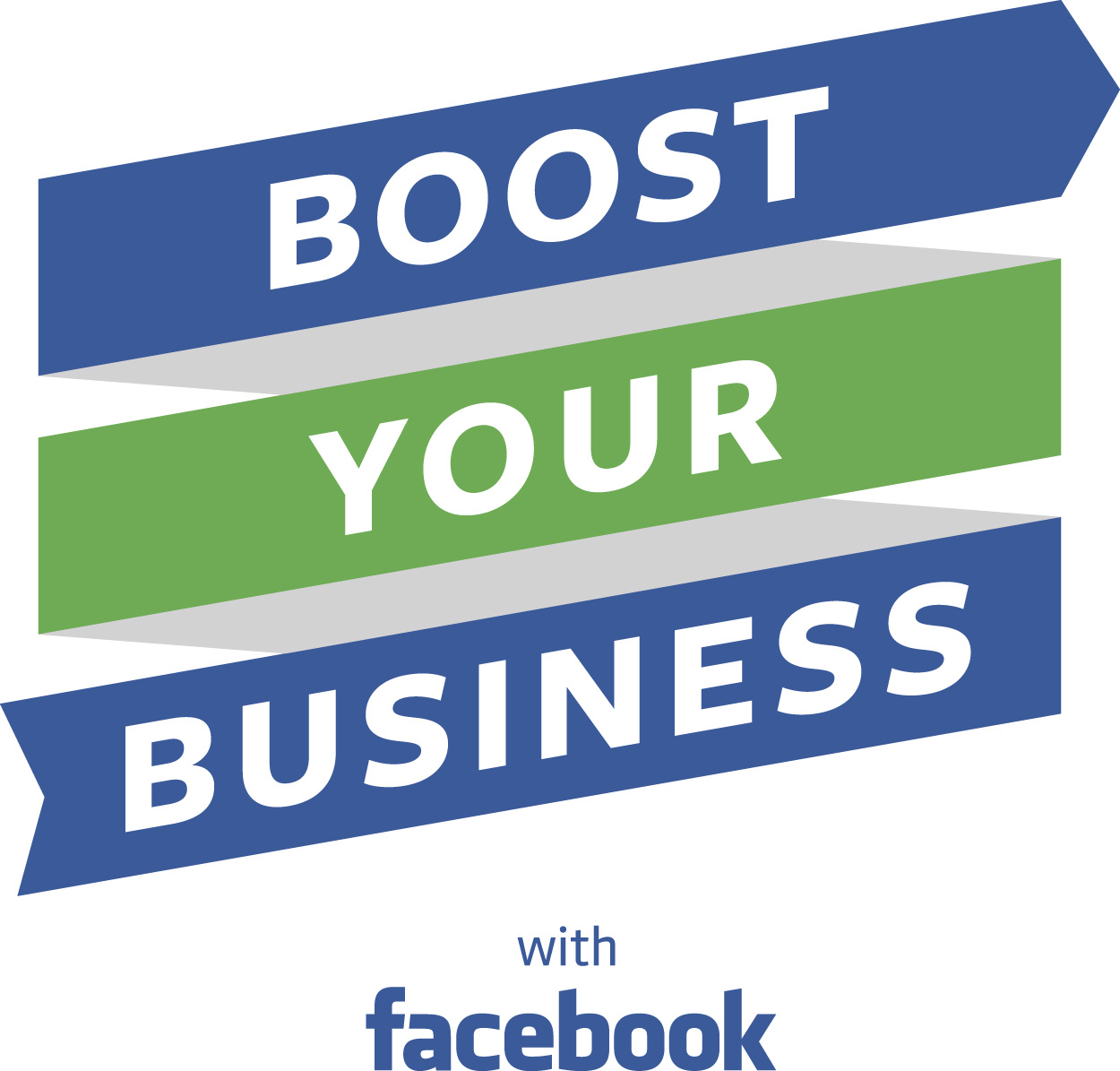
The logo is a simple banner with the words Boost Your Business emblazoned across it. However if you look at the image on printed material (shown below), which was my first encounter with it, the banner has a grey back to represent the reverse side (not behind the letters).

That’s good and makes it look right as you should see both sides as the banner loops around before you.[1] But when you see the logo on every other surface, with images or on screens the grey is gone, the banner is transparent on the sections without words, as in the photo below. Like a semi-reflective film or a James Bond camouflage you can only see it from the one side.
1st fail down. The second fail is the stinker.
Direction[2]
When you use a banner with text upon it you have three common options for the ende. Both can be a classic arrow head. You know a half diamond point, pointing in the same direction. You can have two straight, or flat, ends with the notion being a straight banner. Or you can have a straight end leading to an arrow.

If you choose the third, no matter which end the arrow is at, start or finish, it must follow the direction of the text. the arrow, you see, indicates which way we are going. Take a look at our logo. take a look at our arrow. You’ve seen it haven’t you, the text says ‘Business Your Boost’.
2nd fail. There is no way they wanted to say that, did they?
Sorry guys, if this was your intended approach and you are trying for something clever, something special, then I feel the same. That message doesn’t get to me. Everyone I show this to and indicate my view agrees with me. Anyone disagree?
[Don't forget that you can join in this conversation by using the comments form or by tweeting at @shadowcat_mdk]
Notes
[1] At this point I am not going to complain about their being no element of curve to corners of sense of three dimensions as the designer may have wanted a flat look.
[2] A huge thanks to Tom Bloor who was the first to spot this and to mention it to me while I ranted about transparency.
