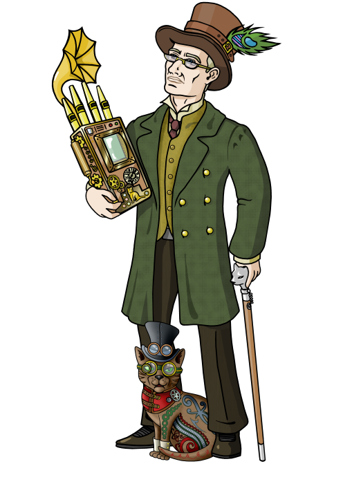
There’s that phrase, ‘a picture is worth a thousand words’ which is (overly) (ab)used in English, I guess the idiom has become the cliché.[1] However I maintain there is a good need for pictures, in fact a rather intrinsic one to humans, and I will explain why I think so.
You’ll probably be aware, or overtly saturated, by the use of infographics, video and pictures[2] across the interwebs. Depending on your nature you’ll either be stimulated, bored or aggrieved by them.[3] However, no matter your personal feelings, it is true that they grab your attention far faster than a line of text. This isn’t accidental it is genetic.
Human beings are a visual animal, it’s why our eyes face forward we are a predator. We are triggered by visuals and we are further stimulated by movement. We track to it without any conscious intervention. Visual input is generally our primary, or initial,[4] information and categorisation source.[5] So using that mechanism has a stronger impact as the relationship is primal whereas language, and more specifically text, is a formal system that was artificially created.
Text as a form of communication comes from the semiotic relationship we have with knowledge transfer. This is also part of our visual makeup. The first text was ideograms and the cave paintings that formulated stories to our primitive ancestors. We created a formalised system as a method of relating and learning across generational divides. It is not a wholly natural skill.[6] Text is constructed and probably a few thousand years old.
So we respond well to visuals and they are a good way of engaging people.
What’s your point…?
For this reason I like to start projects, and get people engaged with, the use of flowcharts and diagrams. They are a quick way that most people will react to with a more positive attitude. Because they stimulate our visual processors first and then we add a semiotic/linguistic interpretation they fire up our minds to thinking.
However there is an issue. This is best summarised by Fred Brooks in the Mythical Man Month. Diagrams and graphics are ambiguous. They can be interpreted and therefore misinterpreted by people. Fred prefers the pure data in a formatted manner. The relationship can be easily seen and precisely quantified/qualified.
But for me the image is a starting point and a method by which to transfer understanding across the skills range. Their ease of interpretation, although adding vagueness, at least allows people without the specific skill to infer from structured data a method to understand relationships.
They are a starting point, a reference point, and a method for integrating the stratified levels of understanding. They shouldn’t be used as the only source though, and they should never replace a well written piece of text.
[Don't forget that you can join in this conversation by using the comments form or by tweeting at @shadowcat_mdk]
Notes
[1] You can go and look at the Wikipedia article for more information.
[2] I’d have said cat images but there is a rumour that the favour is (apparently) switching to dogs, cats maybe an aging meme it seems.
[3] I have a special place reserved in my own hell for animated avatars, pop-over videos and auto-play graphics.
[4] Except where there is a visual deviance such as a visual disability.
