Get strapped in!
Bootstrap is a framework that clearly has had a lot of thought put into its design philosophy and reliability. This should be already evident with the fact they have a currently released fourth major revision. Plus this is no fringe framework, Bootstrap is incredibly popular, its use seen integrated into many templates and software. However how exactly is a site that is more than double the age of the framework going to make use of it? Well, this would have to be taken methodically step by step. Starting with the top of the site layout, which is prevalent everywhere.
Dropdown the Bass
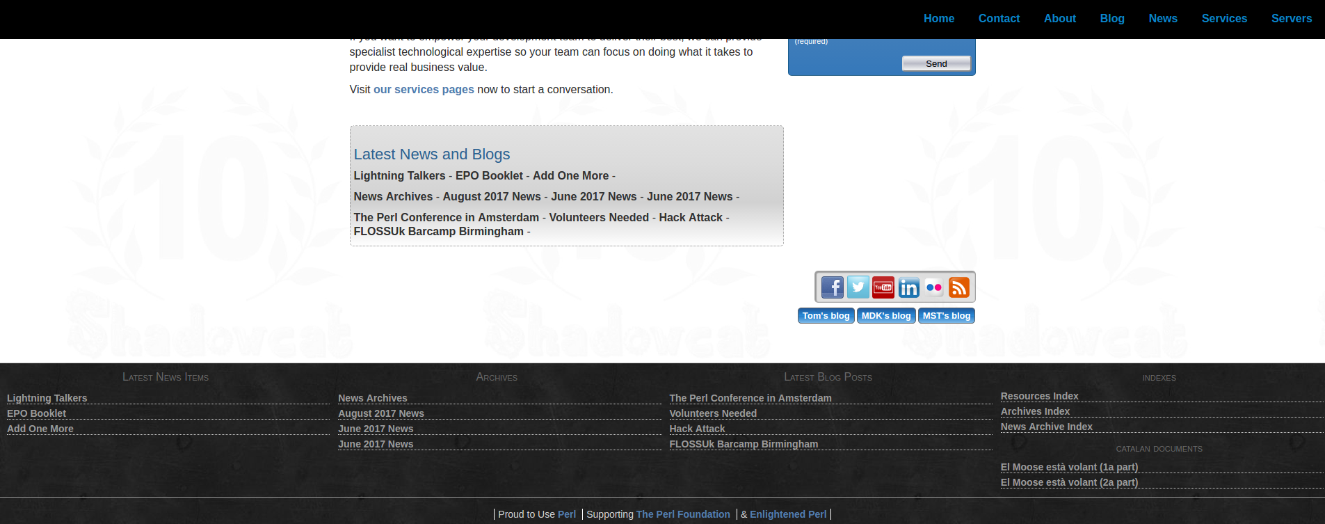
The old archaic layout we had in days of yore. Also known as last week.
One of the main design choices Mark (Keating) had wanted was that a lot of the links that were seen in the old footer (pictured above) were to be removed. But where to? Well, the navbar to be exact. The old navigation bar featured no dropdowns, only links to various pages. However bootstrap natively supports these magical things known as dropdowns, where you can click on a category and gives you a number of options to press. Terribly useful for categorising. So surely adding all those links in the footer to the dropdowns is fairly easy, right? Wishful thinking is always a commodity in development.
Magical code
To give credit, much of the navbar was actually rather easy to introduce to the new type of format in exactly the way Bootstrap wants it. After all with simple links to various places, it's easy enough. Here is a snippet of code that demonstrates it.
<div class="collapse navbar-collapse" id="navbarSupportedContent">
  <ul class="navbar-nav mr-auto">
    <li class="nav-item">
      <a class="nav-link" href="/">Home</a>
    </li>
    <li class="nav-item dropdown">
      <a class="nav-link dropdown-toggle dropdown-toggle" href="#" id="navbarDropdownAbout" data-toggle="dropdown" aria-haspopup="true" aria-expanded="false">
        About
      </a>
      <div class="dropdown-menu" aria-labelledby="navbarDropdownAbout">
        <a class="dropdown-item" href="/about">About</a>
        <a class="dropdown-item" href="/contact">Contact</a>
      </div>
    </li>
    <li class="nav-item dropdown">
      <a  class="nav-link dropdown-toggle dropdown-toggle"
          href="#" id="navbarDropdownNews"
          data-toggle="dropdown"
          aria-haspopup="true"
          aria-expanded="false">News</a>
      <div  class="dropdown-menu SCNavbarNews"
            aria-labelledby="navbarDropdownNews">
        <a class="dropdown-item" href="/news">Latest News</a>
        <div class="dropdown-divider"></div>
        <a class="dropdown-item scnavbarnews entry title link"></a>
        <div class="dropdown-divider"></div>
        <a class="dropdown-item" href="/news/archive">News Archive</a>
      </div>
    </li>
  </ul>
</div>
"Wait, hang on a moment, what is mess going on with that News section?" you may be wondering. This doesn't after all look like some normal HTML. That's because it isn't, it's HTML::Zoom in action. Perl code runs when the page renders and loads it all in. We'll demonstrate below the code that actually makes this magic work and not accidentally turn it into a frog. Then we'll explain how it actually renders, rather than frog tranforms.
package SCSite::SCNavbarNewsFilter;
use Moo;
with 'SCSite::Filter';
The usual Perl required stuff and the use of a "Filter", which is a bunch of mst garble[1] that JFDI. I still have only half a clue in how it actually works, but so long as I can work with it, I'm good. The important thing is that it gets a bunch of content, filters it and gives a stream of what we want.
sub _selector { '.SCNavbarNews' }
This is where we define a selector class where it ties it into the HTML class of the same name.
has _page_set => (is => 'ro', required => 1);

sub _latest_news {
  my $s = shift;
  $s->_page_set
    ->get({ path => '/news/archive' })
    ->children(at_depth => 3)
    ->latest(3)
    ->flatten;
}
What this does is it grabs from the website all the pages which fill the criteria. To note, children depth refers to how deep in file structure we go. After all, it is generally sane to structure your HTML pages with a folder tree format, such as chronologically. It will then grab the 3 latest posts and flatten them for streaming.
sub _filter_stream {
  my ($self, $stream) = @_;
  my @blocks = $self->_latest_news;
  $stream->select('.scnavbarnews.entry')->repeat([
    map {
      my $page = $_;
      sub {
        $_->select('.entry.title')
          ->replace_content($page->title)
          ->select('.entry.link')
          ->set_attribute(href => $page->path)
      } # end of anon sub
    } @blocks
  ])
}

1;
We then grab this stream and do stuff with it! What we do here is essentially picking the classes where we have predefined selectors, then insert in the content we have grabbed, with sensible naming to keep us sane. We loop over our entry, which refers to each news post we have grabbed. From there, we map what we have and insert the entry title and the link for it as an href, which is looped with each entry. It's almost like we thought through our selector naming.
It should be noted that many variations of more complex and simpler form are used also in several cards and almost identically for the latest blog posts. They all however essentially work off a similar flow. So, what has this given us? A dropdown with content that grabs the latest three news posts, as you can currently see right now! It should be noted that much of this code are repurposed versions of what was being used and now ripped out of the old footer.
Google search in a shiny form
<form class="form-inline my-2 my-lg-0" onsubmit="return executeQuery();" role="search">
  <div class="input-group">
    <input class="form-control" type="text" placeholder="Search" aria-label="Search" id="cse-search-input-box-id" autocomplete="off">
    <span class="input-group-btn">
      <button class="btn btn-outline-success" type="submit">Search</button>
    </span>
    <script async type="text/javascript"
      src="//cse.google.com/cse/brand?form=cse-search-box-form-id&inputbox=cse-search-input-box-id">
    </script>
    <script>
      (function() {
        var cx = '001486126476988466845:j-9jkh7alp4';
        var gcse = document.createElement('script');
        gcse.type = 'text/javascript';
        gcse.async = true;
        gcse.src = (document.location.protocol == 'https:' ? 'https:' : 'http:') +
            '//www.google.com/cse/cse.js?cx=' + cx;
        var s = document.getElementsByTagName('script')[0];
        s.parentNode.insertBefore(gcse, s);
      })();
    </script>
    <gcse:searchresults-only></gcse:searchresults-only>
  </div>
</form>
Gosh, that all looks a bit complex, doesn't it? Let's simplify it for more human reading if you're not familiar with this kind of code.
<form onsubmit="return executeQuery();" role="search">
  <div class="input-group">
    <input type="text" placeholder="Search" id="cse-search-input-box-id" autocomplete="off">
    <span class="input-group-btn">
      <button type="submit">Search</button>
    </span>
    <script async type="text/javascript"
      src="//cse.google.com/cse/brand?form=cse-search-box-form-id&inputbox=cse-search-input-box-id">
    </script>
    <script>
      [GOOGLE SEARCH GARBLE]
    </script>
    <gcse:searchresults-only></gcse:searchresults-only>
  </div>
</form>
There we go, that looks a bit more readable. What this has done is integrated the search you can add natively to a Bootstrap navbar with the google website search freely available. To make it sensible with the submit button, it is done inside its own mini form, with the submit then executing the form executeQuery(), where the ID of cse-search-input-box-id ties to the google script what text to search. With that, the google search script code does its google magic, then displays its results in an opened window, defined as "gcse:searchresults-only". Now we have a google search that's secretly integrated with the navbar, rather than an ugly box that stuck out and wouldn't display at all on mobile view. Now we have a complete swank new navigation bar. Neat.
You put your left Footer in...
Ah yes, I did say that it was an old footer earlier. Those more observant will have noted the footer currently in use looks rather different to the one that was present before, as seen in the first image of this blog post above. Indeed, Mark also wanted the footer redesigned and a lot of its now defunct content to be removed. After all, all the various links that were present are now better categorised in those shiny new dropdowns we discussed earlier. Plus, there was a variety of buttons that were currently on the index in the forms of social buttons and blog links that just simply looked out of place, plus would be cooler to have prevalent on every page you were on. Now, if only we had a footer to put them into...
The footer, now much sparser than ever, had to be recreated to use the Bootstrap column and row layout. For a good reason mind you, it meant that it restructured quite happily once in a narrower viewport, such as a mobile phone. Bootstrap after all uses a grid system based on the infamous flexbox. So what did we do with the Shadowcat footer?
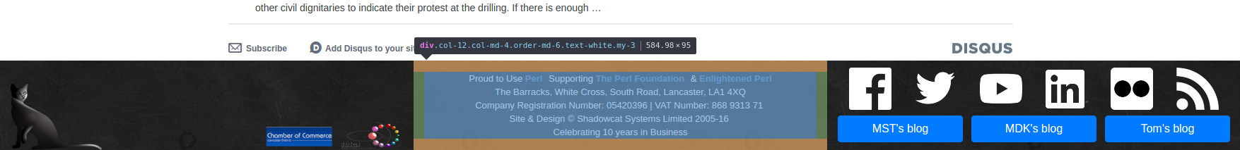
I don't expect you to be able to read the text easily, this is just for visual purposes.
As you may notice based on the image, I appear to have a section highlighted. In Bootstrap terms, the footer is an entire "row" and contained in that row are three columns, which have classes attached to it that say "if the screen size gets smaller than I tell you, put them one over the other instead.". The Bootstrap grid splits every row into 12 columns and you can assign something an amount of columns. Here is an example.
<div class="row">
  <div class="col-12 col-md-4">
    Content
  </div>
  <div class="col-12 col-md-4">
    Content
  </div>
  <div class="col-12 col-md-4">
    Content
  </div>
</div>
So let's go through these classes which form the basics of the bootstrap grid. We first make the row that the entire thing is contianed in. Next we have the column. By default, it is a column that will take up the entire row, such that the next column takes up a new "row". This is because the col-12 means that it takes up the entire 12 columns of a row. But we also have here col-md-4. What it does is that if the viewport is 768 pixels or more wide, it will only take up 4 of the 12 rows. Thus, if you have a viewport wider than 768px, it will show all three columns, as they fit the three columns of width 4 into the space of 12.
The content of the footer itself is fairly boring, containing mostly information of the company as before. However now it also has the links to the blogs in buttons, which order themselves properly based on viewport size, plus the social media icons. These new icons are transparent ones which can be found in the brand resource pages of any social media outlet, such as this page for Twitter. Boring as they look, the layout was given a lot of testing and breaking to see what would work best dependent on the different screen sizes.
That it?
With all that in mind, we have covered quite a chunk of how the site has been redone. But wait, there's more!
We still have yet to go through how several parts of the website were converted into cards. Quite a lot actually. Ironically, it nothing to do with the Shadowcat Trading Card Game, or as I like to call it, the SCTCG. It is instead on Bootstrap cards and can be read here.
Notes
[1] Code written by Matt Trout (mst) is infamous for writing code that simply works but is also insanely concise, to the point of taking a while to actually understanding what is happening.
